Saturday, 30 April 2011

Making of 2nd DPS.

During making my second DPS, I had a lot of trouble making the photos fit well onto the page, what with making them blend into the background well and choosing where to put them.


Here's how my DPS started off:


I really didn't like the way I had put the photos on, and I couldn't get the photos to blend into the background well.


Then I decided to come back to the photos later, and put the text on instead:

I used Picasa to get the text onto the photo.


Then I tried again on Picnik to get the photos the right colour to blend into the background. I had to flip a photo of M. Shadows, because he was facing to the right and it just looked wrong, so now he is facing the left. Here are a few of my failed tries:


These photos didnt blend into the background well enough, then I jumbled around the photos to make the brighter ones to be closer to the top of the page, where the fire is, and the darker ones to the bottom of the page.

Then I wrote the review itself. This is the body of the text:

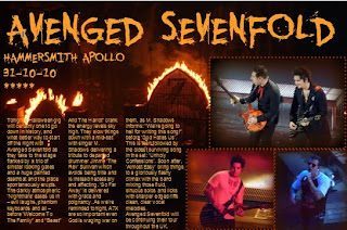
"Tonight's Halloween gig will certainly be one to go down in history, and what better way to start off the night with Avenged Sevenfold as they take to the stage flanked by a trio of sinister looking gates and a huge painted deathbat, and then the place spontaneously erupts.

The darkly atmospheric "Nightmare" eases us in - evil laughs, phantom keyboards and all - before "Welcome To The Family" and "Beast And The Harlot" crank the energy levels sky high. They slow things down mid-set with singer M. Shadows delivering a tribute to their departed drummer - Jimmy "The Rev" Sullivan, which avoids being trite and is instead necessary and affecting. "So Far Away" is delivered with grace and poignancy.

As we're reminded tonight, A7X are so important, even God is waging war on them, as M. Shadows informs "We're going to hell for writing this song!" before "God Hates Us". This is then followed by the oldest surviving song in the set - "Unholy Confessions". Soon after, "Almost Easy" brings things to a gloriously flashy climax with the band mixing those fluid sinuous solos and licks with sharper edged riffs and clean, clear vocal melodies.

Avenged Sevenfold will be continuing their tour throughout the UK."


And this is the final piece:
Wednesday, 13 April 2011

2nd DPS (Live Review)

I know we're not really supposed to do more than one DPS but I originally planned to do a live review, so here it is :) The reasons for my photo choices are, I had to include one of the lead singer (M. Shadows), I also included one of the guitarists: Synyster Gates and Zacky Vengeance. I used that photo because they are doing their famous back-to-back pose (I'll post a professional photo to back up my point). I would've taken a photo of the crowd like they do in Kerrang! but I was in the seated area of the venue so I would've got an awful photo.

It took ages to get the photos to look right on the background image because I couldn't get the faded colour the same as the background colour. Hopefully this looks good to everyone else, I'm pleased with it :) And also I like the actual review I've written :P


Here's Syn and Zacky's signiture pose that I said about earlier:


I used the idea of using one of the photos to be the background, I had this idea thought out a while ago, then I saw one of my Kerrang! magazines had done this too. I've scanned in the picture and here it is:

Finished DPS SPELLCHECKED

Okay, I'm an idiot and forgot to spellcheck the interview. So here it is, corrected. :)

Finished DPS

Here is my finished DPS for my magazine :) I'm quite happy with it and how it turned out. The reason I changed the colour of the font half way through is because it was against a white background and it couldn't be read :/

feedback would be cool :)

Finished Contents

This is my finished contents page. I'm not fully happy with it...I've tried using different fonts on the bit where the contents are listed...it just looks naff with whatever font. I cant think how to change it, but im pleased with the top half of it.

Tuesday, 12 April 2011

Finished OFC

This my finished OFC. I think I have kept it quite conventional - I've sticked to the 3 colour colour scheme (Pink, White and Yellow). I dont think it looks too cluttered, I think it has just the right amount of things that should be on a OFC.


Kerrang! has been the magazine to influence me. Heres a similar Kerrang! OFC:

Monday, 11 April 2011

OFC half completed

I've been editing this for the majority of the day. The thing that took up the most time was the torn out pages. After I erased the black background on the page, I put it on my OFC. Then I had to erase some white on the upper layer so the lower layer (where the photo is) can be seen. Heres a screenshot of it:


This is my OFC so far:


(The name of the band is Page Two...thats because both their sirnames is Page...and I made a very bad pun out of it xD )

Mounted poster previews, finished.


This took ages to get the notepad template and also GIMP decided not to work -.- so I had to uninstall it then reinstall. Finally got these finished though. They will be on the OFC.


Poster Previews

Previously, I have said that I wanted to mount my poster previews onto a template then onto the OFC so it doesn't look like it just been put carelessly on a page. Kerrang! sometimes uses a notepad template although I cant find an example at the moment..and I stupidly threw away the Kerrang! that had the example on it... :( I have tried to find one like it, but most of the ones I found you had to pay for. I found one for free but it had a black background so I had to get rid of the black:


I liked the torn notepad idea because it gives the magazine a rough look to it, which is one of the stereotypes of rock/metal.

Which one to use?

I've created two OFCs with just the banner edited on. Im stuck deciding which one to use.

Here are the two:


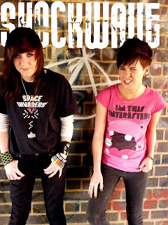
I like the 'Shockwave' one because it goes all across the top of the OFC. But I also like the 'Decibel' one because I would have space to put my tag line (Ready...Steady...ROCK!) above Loz's head. Although the 'D' on 'Decibel' isn't as easily recognised as a 'D' as the 'S' on 'Shockwave' is.
I'm kind of towards 'Shockwave' to be honest...

Maybe could some people comment and say which one they like better and why? Thanks :)

Sunday, 10 April 2011

Layering my OFC photo.

I have FINALLY figured out how to use GIMP. I tried to look through the instructions manual...but it made no sense...at all! So after...25ish mins of fiddling with GIMP, I've finally figured out how to master layering! :D At first I started playing with layers trying to cut out the text on one of the layers so the heads would be infront of the text...this didn't work in the slightest (to be fair I've never edited properly before).

Eventually I found this method: First I placed the text on the image:

Then I zoomed in and used the eraser tool to erase a part of the layer: (baring in mind..these aren't finished so thats why they dont look good at the moment)

After finishing that, I merged the layer into the orignal layer, and here's the layering finished:

And heres it out of GIMP:


I'm very happy with how this turned out seeing as I never thought I could get anywhere close to actually being able to layer photos! :D

Problem with photoshop.

For some unknown reason, the Photoshop website, whenever I click download, it says the site area is unavailable... Until it works I'll have to use Picasa and Picnik. I shall keep trying to get it to work. I've downloaded GIMP to see if that has layering effects. I want these effects so I can get the title of the magazine to be behind the subjects' heads. This would look more proffessional than it being on top. GIMP has just finished downloading and it DOES have layering effects, so now I've just got to figure out how on earth to use it...

Editing photo for OFC.

When I looked at the photo I'm planning to use for my OFC, to me, it looked kind of dull. So on Picnik and Picasa I brightened up the anarchy graffiti behind the subjects.


Heres the original photo:


Heres a screenshot of the editing using the 'doodle' tool.


Heres the edited photo:


I'm quite pleased with how this turned out even though it was only a tiny bit of editing. I've never done editing before so I had fun fiddling with the tools and seeing what they did.

'Photoshoot' for OFC with Lauren and Georgia.

These are the better photos of the bunch I took using different locations within the park in Wellingborough


Risk Assessment 2

There aren't many risks for the location I used. Here are some:

  • Falling off a railing

  • Falling off the ledge they stood on

  • Dropping camera in the river

  • Dropping the guitars

  • Sunburn (it was quite a sunny day)

Luckily, none of this happened :)

Shooting Schedule 2

I recently realised that I wouldn't be able to use my live photos for my OFC image as it would be too fuzzy. So I asked my friends Loz and Pie to be my models :) I decided to do my 'photoshoot' today (10th April) in a park in Wellingborough near the prison. The people included in the photoshoot are Lauren Page and Georgia Page, using mine and Georgia's guitars.

Mock ups

Here are some mock ups of what my magazine will look like, done on Publisher. Some changes might have to be made due to the photos I have taken.


Wednesday, 6 April 2011

Photoshop and Picasa

Im going to download the trial version of Photoshop to design my magazine OFC, contents and DPS (because I cant afford the real photoshop). I'm also going to experiment on Picasa. I'm going to download it to my netbook tonight and put up my experiment OFCs.

I'm also trying to find templates for things such as ripped out notebook pages and polaroid photos to mount my photos on. I'd like to put my poster previews onto a "background" before putting them on the OFC, otherwise it'd look unprofessional. Whilst searching, I came across a smashed glass effect that could be used on Photoshop. When I download it tonight, I'll see if it is possible to get that effect on the free 30 day trial version. I found some demos on how to use Photoshop and it's effects on google - I'll use these to help me, as I've never used Photoshop before.