Tuesday, 3 May 2011

Contents Page, Redone.

I decided that I really did not like my old contents page. To be honest, I thought it was terrible and didn't know what to do about it. So recently, I looked at existing contents pages in Kerrang! and tried to base mine on that, seeing as Kerrang! is my model magazine.

Here is my new contents:

Im not quite sure why it's turned out so blurry...I cant get it to be clear...

This is my old contents:


I think my newer contents page is far better because it looks more organised and more realistic.

This is the contents page I based it on:

Saturday, 30 April 2011

Making of 2nd DPS.

During making my second DPS, I had a lot of trouble making the photos fit well onto the page, what with making them blend into the background well and choosing where to put them.


Here's how my DPS started off:


I really didn't like the way I had put the photos on, and I couldn't get the photos to blend into the background well.


Then I decided to come back to the photos later, and put the text on instead:

I used Picasa to get the text onto the photo.


Then I tried again on Picnik to get the photos the right colour to blend into the background. I had to flip a photo of M. Shadows, because he was facing to the right and it just looked wrong, so now he is facing the left. Here are a few of my failed tries:


These photos didnt blend into the background well enough, then I jumbled around the photos to make the brighter ones to be closer to the top of the page, where the fire is, and the darker ones to the bottom of the page.

Then I wrote the review itself. This is the body of the text:

"Tonight's Halloween gig will certainly be one to go down in history, and what better way to start off the night with Avenged Sevenfold as they take to the stage flanked by a trio of sinister looking gates and a huge painted deathbat, and then the place spontaneously erupts.

The darkly atmospheric "Nightmare" eases us in - evil laughs, phantom keyboards and all - before "Welcome To The Family" and "Beast And The Harlot" crank the energy levels sky high. They slow things down mid-set with singer M. Shadows delivering a tribute to their departed drummer - Jimmy "The Rev" Sullivan, which avoids being trite and is instead necessary and affecting. "So Far Away" is delivered with grace and poignancy.

As we're reminded tonight, A7X are so important, even God is waging war on them, as M. Shadows informs "We're going to hell for writing this song!" before "God Hates Us". This is then followed by the oldest surviving song in the set - "Unholy Confessions". Soon after, "Almost Easy" brings things to a gloriously flashy climax with the band mixing those fluid sinuous solos and licks with sharper edged riffs and clean, clear vocal melodies.

Avenged Sevenfold will be continuing their tour throughout the UK."


And this is the final piece:
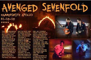
Wednesday, 13 April 2011

2nd DPS (Live Review)

I know we're not really supposed to do more than one DPS but I originally planned to do a live review, so here it is :) The reasons for my photo choices are, I had to include one of the lead singer (M. Shadows), I also included one of the guitarists: Synyster Gates and Zacky Vengeance. I used that photo because they are doing their famous back-to-back pose (I'll post a professional photo to back up my point). I would've taken a photo of the crowd like they do in Kerrang! but I was in the seated area of the venue so I would've got an awful photo.

It took ages to get the photos to look right on the background image because I couldn't get the faded colour the same as the background colour. Hopefully this looks good to everyone else, I'm pleased with it :) And also I like the actual review I've written :P


Here's Syn and Zacky's signiture pose that I said about earlier:


I used the idea of using one of the photos to be the background, I had this idea thought out a while ago, then I saw one of my Kerrang! magazines had done this too. I've scanned in the picture and here it is:

Finished DPS SPELLCHECKED

Okay, I'm an idiot and forgot to spellcheck the interview. So here it is, corrected. :)

Finished DPS

Here is my finished DPS for my magazine :) I'm quite happy with it and how it turned out. The reason I changed the colour of the font half way through is because it was against a white background and it couldn't be read :/

feedback would be cool :)

Finished Contents

This is my finished contents page. I'm not fully happy with it...I've tried using different fonts on the bit where the contents are listed...it just looks naff with whatever font. I cant think how to change it, but im pleased with the top half of it.

Tuesday, 12 April 2011

Finished OFC

This my finished OFC. I think I have kept it quite conventional - I've sticked to the 3 colour colour scheme (Pink, White and Yellow). I dont think it looks too cluttered, I think it has just the right amount of things that should be on a OFC.


Kerrang! has been the magazine to influence me. Heres a similar Kerrang! OFC: