Monday 28 February 2011

Risk Assessment

In all four of the venues, there are quite a few safety hazards:


  • It is possible to pass out from the excessive heat levels due to the amount of people and the stage lights

  • You could get injured if in the standing section of the crowd

  • Your camera could get stolen

  • Your camera could get broken

  • Where I was sitting at Wembley Arena, I was directly at the top of the stairs - it was ridiculous to place seats there as I could've fallen and injured myself.


I managed to get the stairs I'm talking about in a photo I accidently took:


See what I mean? It's so steep! Dangerous...

Recce - Locations

Locations

The photos that I will use have been taken in:

  • Hammersmith Apollo
  • Birmingham LG Arena
  • Wembley Arena
  • Nottingham Trent Arena
I have chosen to use these locations because I thought I could attempt to get some decent photographs that would look good enough to be in a music magazine. Plus it is also the natural setting for these type of photos to be taken in. Luckily, my photos were a success! I've spoken to Mrs Fearnley and she said my photos were perfectly fine to use! :) I was suprised I got good photos seeing as I was jumping all over the place during the gig :P
Hammersmith Apollo:

This was what was on the outside (picture from google):


This is what it is like on the inside (my picture):

(google picture):

Birmingham LG Arena:
From the outside (google pic):


This photo was taken at a different concert to the ones I'm including pictures from - so that's why the pictures will be taken from the other side of the arena...just to make it clear :)


This is from the MCR concert:


Wembley Arena:

The outside:


The inside before the show:


Inside during the support band:


Nottingham Trent Arena:
From the outside (google pic - its the building on the left, it's the only one I could find):

Inside during the support band:


Inside during MCR:

Deciding on my target audience using SAGEL

I can decide on my target audience by using SAGEL.


Socio Economic Group

Age

Gender

Ethnicity

Lifestyle


I'm going to use SAGEL to help me distinguish what my target audience is, it'll be easier because it'll be sorted into sections to help create one idea of an target audience.


The social class will consist of emo/greb style, as this is the type of music they would listen to.

The age will be for teens and young adults (approx 14-21) but it is also fine for other ages to read it also


The gender will be both male and female - I've decided this because magazines existing today (e.g Kerrang!) were originally aimed at men, but women still bought it, so the gender doesn't really matter - it's all about the music! :D


I'm aiming to appeal to all ethnic groups, because once again, it's all about the music! :D


The people who read this will obviously have big interests in music. They could be keen gig attenders.


My target audience will look something like this:

Moodboard


Examples of Kerrang! live reviews (My Chemical Romance and Avenged Sevenfold)

These are two examples of Kerrang! live reviews that I have scanned from my own copies of Kerrang!.

I have decided to post examples of these because for my double page spread, I am going to do a live review - I decided this because I thought it would be rather awesome to use some photos I took from recent concerts I've attended. I will be using photos from either of the 3 dates I saw My Chemical Romance and photos from the Avenged Sevenfold concert I went to.

Kerrang! uses a style on their live reviews with smaller photos scattered across the 2nd page of the double page spread. There is ALWAYS a part where they ask "How was it for you?".

Just for the sake of saying this - the reviewer for the MCR concert obviously had no idea what they were talking about...they deserved WAY more than 3 stars :( That gig was amazing!

Anyway, back on task...Kerrang! tend to use quirky little captions for the photos, this gives a little bit of humour to the magazine.

All these aspects are very consistent throughout each issue.

Example of a Kerrang! double page spread

This is an example of a Kerrang! double page spread that i scanned from my Kerrang! magazine.
The colours have been chosen well, red is part of the main colour pallete, plus it matches Gerard's hair.
Kerrang! has followed it's house style by having 3 columns per page, with the text wrapped around the photo.

Uses and Gratifications

Uses and gratifications is about what people do with the media, rather than what the media does to people. This theory assumes that members of the audience are not passive but take an active role in interpreting the media into their lives. This theory also states that the audience are responsible for choosing the media to suit their needs.

Blumler and Brown (1972) stated 4 primary factors for which a person may use the media:

Diversion - Something to do to escape from reality and their problems

Personal Relationships - Using the media to discuss with friends, such as tv programmes will be talked about between friends.

Personal Identity or Individual Psychology - Defining yourself by your media texts

Surveillance - Finding out about the world, your favourite bands, when they were on tour etc..

Deconstructing a rock star - Synyster Gates

Synyster Gates is the lead guitarist of Avenged Sevenfold.
Firstly, his stage name makes him seem instantly more popular as opposed to his real name (Brian Elwin Haner Jr). His tattoos and muscles give the impression he can be quite dangerous - this links with a Kerrang! OFC that I posted recently, where it says "Avenged Sevenfold - The Worlds Most Dangerous Band".
He conventionally has black hair - in this photo, his hair is mid length, whereas now he has it gelled up in spikes:
This adds to his dangerous look. He also ALWAYS wears 'guyliner'. This shows that he does care what he looks like, unlike some rock stars.

Deconstructing a rock star - Gerard Way

Gerard Way is the lead singer of the rock band My Chemical Romance. He follows a typical convention of having black hair and wearing stage makeup.

Although he is breaking the convention by wearing a uniform. The rest of the band are also wearing a uniform togive themselves a sense of identity.


My Chemical Romance have changed their attire throughout the years, during the Three Cheers For Sweet Revenge era, they wore suits and bulletproof vests as a uniform.


The constant idea of a uniform gives off the impression that they are not separate people who happen to be in a band together - they are one.

Wednesday 16 February 2011

Summary Post

I have done some research on music magazines. The research I have done is helping towards making my decisions on my magazine.

Music magazines always have a title that is music related, for example: Kerrang! is supposed to be the sound of the feedback of a guitar. Q is also another example, it was going to be called "Cue" but reader's would've related that to snooker instead of music. I will make my title music related.

Usually, the main image is of the main band featured in the issue. The conventional style of shot is a mid close up, but some magazines do tend to use long shots and close ups. For my magazine, I'm going to do a live review, so one of my better photos will be presented on the OFC. This would mean breaking the convention of mid close ups, it'd be a long shot.

The colour palette is usually limited to 3 or 4 colours, if there were more it'd look extremely cluttered and unorganised. Although some magazines can use more colours, for example, NME used more colours to emphasise the main theme of that weeks issue: it was a issue with the Top 50 Druggiest albums - so it suited the theme. For my magazine, I will use the conventional amount of colours.

The selllines are also music related, for example Kerrang!'s sellline is "Life is Loud".

Inside the magazine, the interviews are posted in columns with photos supporting the text. Sometimes there are extra boxes with text that isnt related to the same topic as the interview, but with the same band.

NME Textual Analysis


Like I said before, the logo is in the top left corner of the OFC. The colour palette has stuck to red, white and black. The main parts of the magazine have been written in white to contrast with the black to stand out and grab the reader's attention. The photo on the OFC doesnt follow the conventional style of a magazine, because the OFC normally has a mid close up shot of the band featured, whereas this is a long shot.

Thursday 10 February 2011

NME Research

This information was found on Wikipedia. (not copied and pasted)
NME (New Musical Express) was first published on 7th March 1952 as a weekly magazine. In the 1970's it was labelled as the best selling music magazine. Krissi Murison is the first female editor of NME and took up this role in 2009. During the 70's, it became Britain's best selling musing magazine. In the period 1972 - 1976, NME was associated with "gonzo journalism", then later became closely associated with punk rock.
During October 2009 and September 2010, NME was read by 333,000 people, 257,000 were men and 76 were women.
The house style has stuck the same over the years, the logo is always in the top left corner of the OFC and is normally red. The colour palette usually sticks to red, white and black.

Examples of NME OFCs


Kerrang! Textual Analysis

On the OFC, the banner is always in the same place and the same size. The house style usually uses the same style, the colour scheme uses red, yellow and black. No pastel colours are used because that would give an impression that the magazine is 'friendly'. On every issue, the artists are looking directly at the camera and it is normally a mid close up. The red on yellow clashes to grab the readers attention.

To prove the point the house style is the same, including the same colour schemes, here's another example:

The contents page also follows this house style:


The contents is always down the right hand side, with photos on the left side of the main article.

There is normally a little note from the editor explaining the issue.
The contents page used to have a black background with the contents down the left side with one main photo on the right.

The contents page has changed recently, now the contents are on the bottom half of the page with the photos at the top.
This is an older contents page:
This is the newest version of the contents page:


Wednesday 9 February 2011

Research Methods

In the lesson, we learnt about the different types of research methods. The four methods are:
  • Primary
  • Secondary
  • Quantitative
  • Qualitative
Primary Research

Primary research is research that you carry out personally. Some methods of this are:
  • Questionnaire
  • Interview
  • Online Poll
  • Survey
  • Focus Group (a group of people that you question)
  • Letter
  • Textual Analysis
Although these may seem good methods, some can be unreliable, such as questionnaires. People may lie or misinterpret the question, it is also time consuming.
Secondary Research

Secondary research is research that has been carried out by other people. Some methods of this are:

  • Internet
  • Books
  • Newspapers
  • Newspapers Archives
Quantitative Research

For quantitative research, lots of people are needed to gather this research. An example of a method suitable for this research is a questionnaire.

Qualitative Research

For qualitative research only a small amount of people are needed to gather research. An interview would be suitable for this type.

Thursday 3 February 2011

Examples of a Kerrang! special.

Here is an example of a special featuring each band member on a separate OFC.


Examples of Kerrang! OFCs


Kerrang! Research.

This information was found on Wikipedia. (not copied and pasted) although some is my opinion.

For the main task, we have to create a music magazine. I'm going to research two magazines: Kerrang! and NME. This research will help me design my own magazine.

Kerrang! is a popular weekly magazine. In the magazine, it features successful bands as well as new bands. Kerrang! normally focuses on interviews and gig guides. Every week it has free posters, and sometimes free gifts such as CDs, stickers, giant posters etc.

Kerrang! is targeted at teenagers and young adults that are interested in rock/metal music. It is only £2.20, which personally, I think is a very good price for the quality of the magazine, plus, it is also a suitable price for teenagers.

The house style is always very "in your face". The banner is very recognisable, it aims to get noticed. Kerrang! gives the impression that it is a 'loud' magazine, it's tag line helps this idea - "Life is Loud". It always has previews of the posters included along the bottom of the OFC. Normally, right at the top and the bottom, it lists a few bands that are featured in the issue.

It is published by Bauer Consumer Media and distributed by Gordon and Gotch. The first issue was released on 7 June 1981 and AC/DC were on the OFC. The original owner of Kerrang! was United Newspapers, it was then sold to EMAP in 1991. In 2008 EMAP sold Kerrang! to Bauer Consumer Media. Paul Rees was the editor from 2000-2003 but he quit to edit "Q". Nichola Brown is the current editor of Kerrang!

Social groups are represented as music-obsessed, but in a good way. They are also represented as fun, and that they can take things not so seriously.

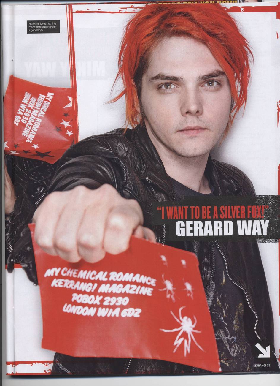
Over time, there are certain bands that keep cropping up on the OFC again and again, for example: My Chemical Romance, Avenged Sevenfold and Slipknot. Kerrang! has a feedback page, readers can write in and ask for certain bands to be interviewed, also they give their feedback on previous issues, to help Kerrang! improve.

Sometimes, Kerrang! releases 'specials'. For example, a few years ago there was a Metallica special. Recently, there was a special on My Chemical Romance, there was a OFC for each member of the band.

Wednesday 2 February 2011

Prelim Task - Completed

This is my finished OFC for the prelim task.


I made this in Publisher. I chose the font to make it seem more friendly and inviting towards the students, although I have kept the photo formal to promote a good impression of the school.


Prelim Task Photos

These are some photos I took for the prelim task. I thought if it was taken in the library, it would make it seem more educational, than if it was taken in the common room.


Prelim Research


I did some research into school magazines' OFCs. Here are some examples I found: