Rude Metal Shadow:
I liked the two 'Rude Metal' fonts because they were the closest I could find to a real Iron Maiden font.

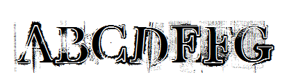
Rude Metal:


You Murderer:
I like this also, in my opinion, it's too thin. I chose it because it was the closest I could get to Slipknot's real font.


Satan Posessed:
I'm not going to use this font because to me, it just doesn't suit the metal genre. It could maybe suit punk, but I'm not doing a punk magazine.

Face Your Fears:
Once again, this is quite similar to the Slipknot font.

Valium:
I really really like this one, but I dont think it would look good on my OFC, it looks too delicate to be representative of metal - so I wont use this.


Rock Garage:
I might use this font, but if I keep the font black it wouldn't look right because there would be too much black on my OFC (seeing as black is my main colour in the colour scheme). If i turned it a different colour, I may consider it.

Rock It:

Rock It:
I think this font is totally awesome! It looks like the sort you would find on a rock/metal magazine, e.g Rocksound.


Rock:
This font is really cool, but I dont think I will use it because it is too 'curvy'. It looks like it could suit a more classic rock magazine, or maybe soul or jazz..or something...but definately not metal.

Retro Rock Poster:
Misfits:
Grave Digger:

Retro Rock Poster:
I'm seriously considering using this one.
Misfits:
I like this font because it is easily recognisable as being the font for The Misfits.

Hard Rock:
I like this because it has the faded, worn out look that is a part of the fashion side of metal.


Grave Digger:

No comments:
Post a Comment